

CL_水都大阪コンソーシアム/イベント用フライヤー/A4両面(上2枚)・看板(下)/2024
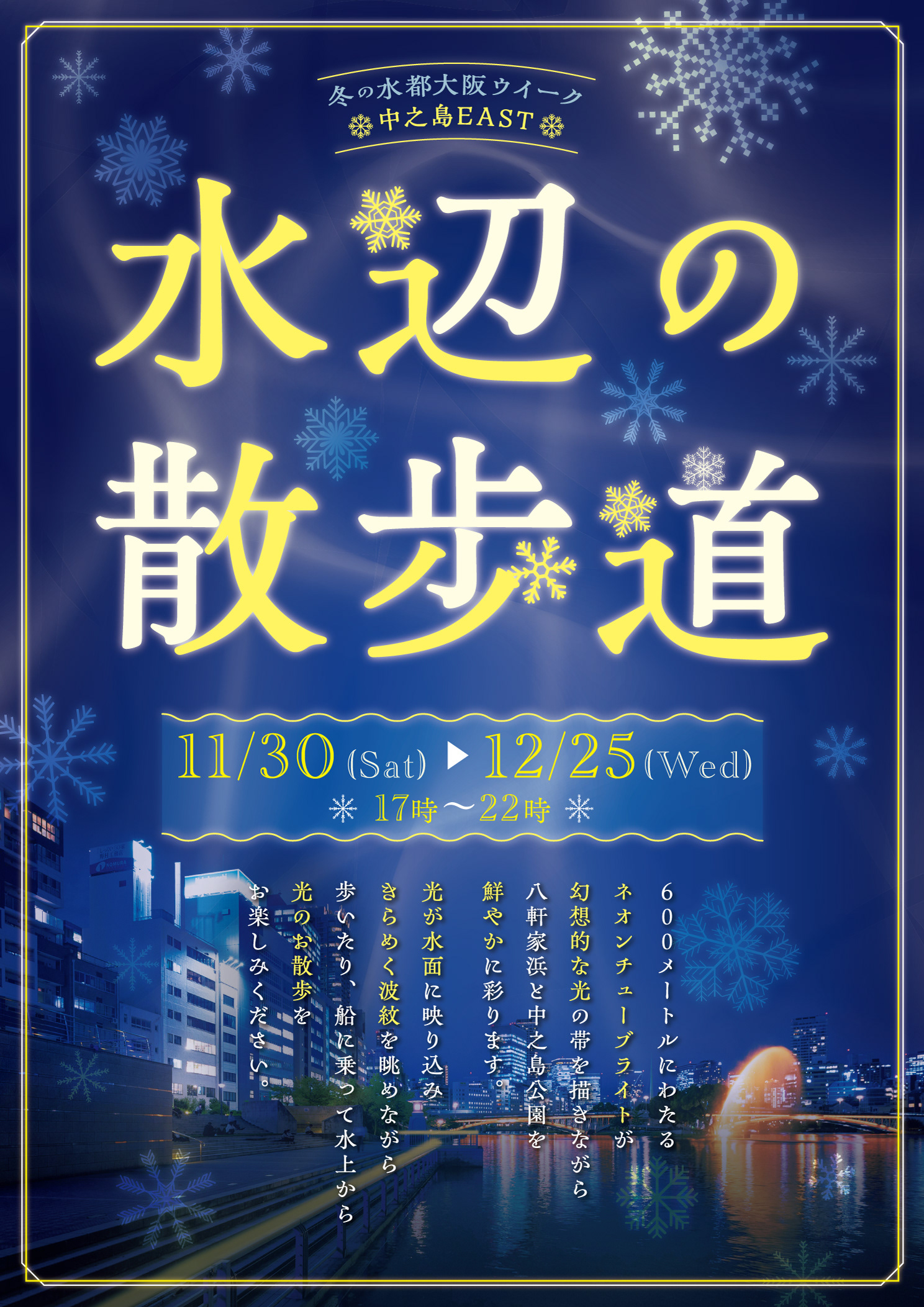
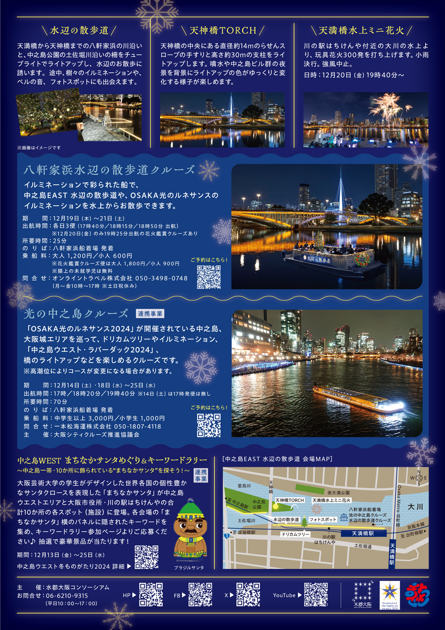
水辺の青とネオンチューブの黄色をキーカラーに、光と水のゆらぎを描いた幻想的なビジュアル。冬の夜を楽しむ、中之島のイルミネーション散歩道を表現しました。
水辺の青とネオンチューブの黄色をキーカラーに、光と水のゆらぎを描いた幻想的なビジュアル。冬の夜を楽しむ、中之島のイルミネーション散歩道を表現しました。
CL_KUZUHA MALL/イベント用フライヤー/A4両面/2024
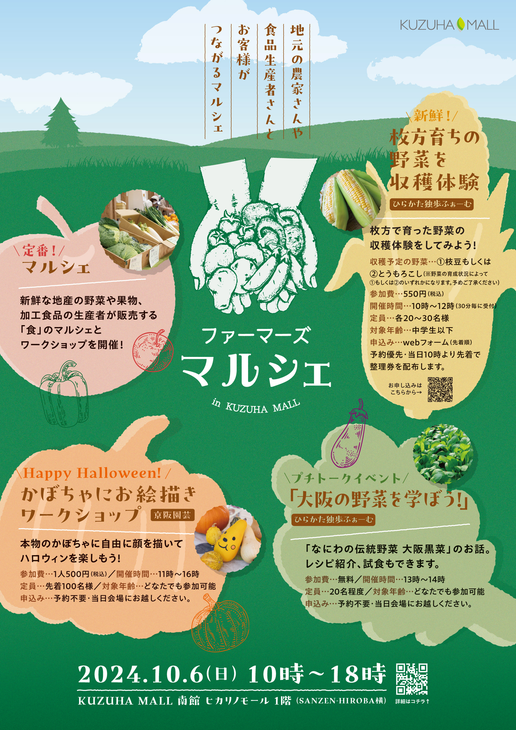
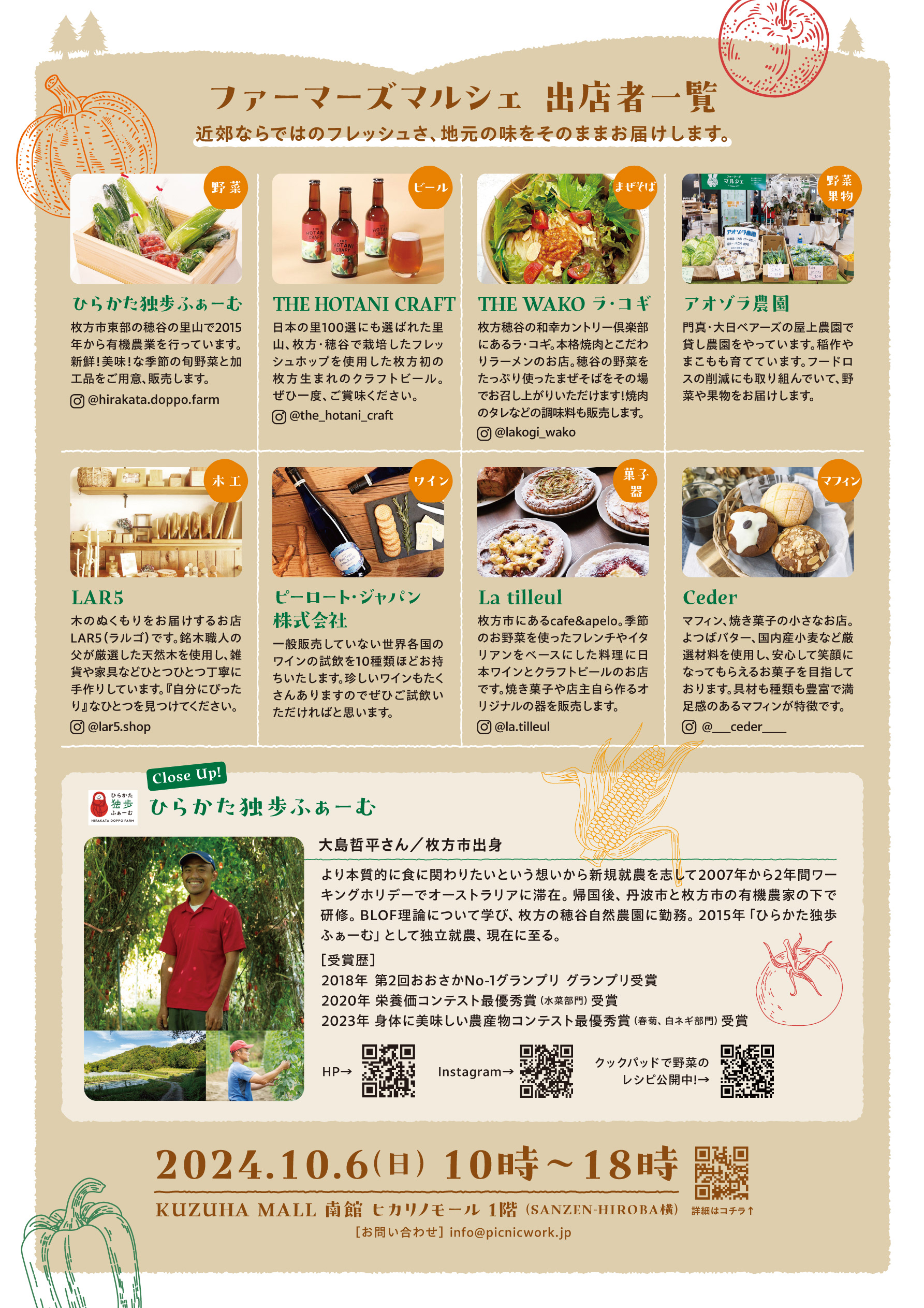
ロゴとキーカラーのグリーンが既に決定していたので、それを活かすために背景にキーカラーのグリーンの草原イラストを使用。野菜型の枠を作り、そこに詳細を入れてランダムに配置。楽しくて暖かみのあるデザインに仕上げました。
ロゴとキーカラーのグリーンが既に決定していたので、それを活かすために背景にキーカラーのグリーンの草原イラストを使用。野菜型の枠を作り、そこに詳細を入れてランダムに配置。楽しくて暖かみのあるデザインに仕上げました。
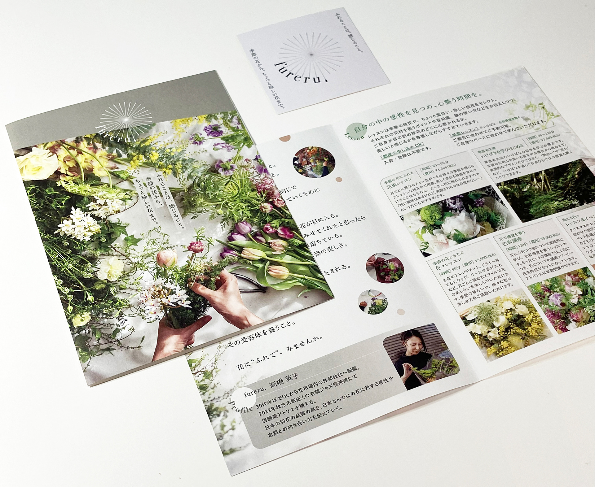
CL_fureru./フローリスト/ショップカード・レッスン用パンフレット/2024
ロゴに始まりショップカード・パンフレットまでトータルで制作。敢えてモノトーンをシンボルカラーに採用し、個性的で落ち着いた雰囲気を演出。
ロゴに始まりショップカード・パンフレットまでトータルで制作。敢えてモノトーンをシンボルカラーに採用し、個性的で落ち着いた雰囲気を演出。
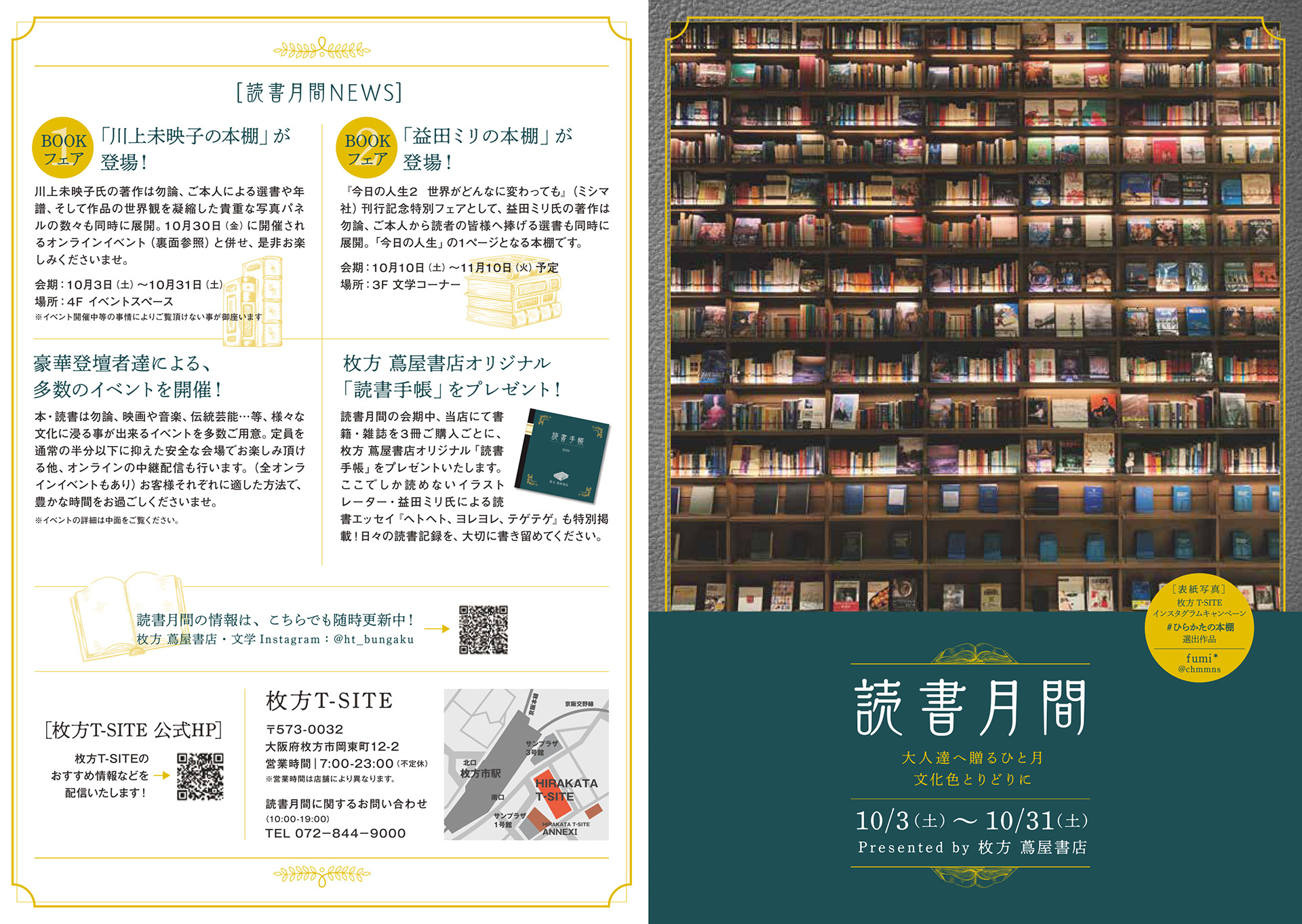
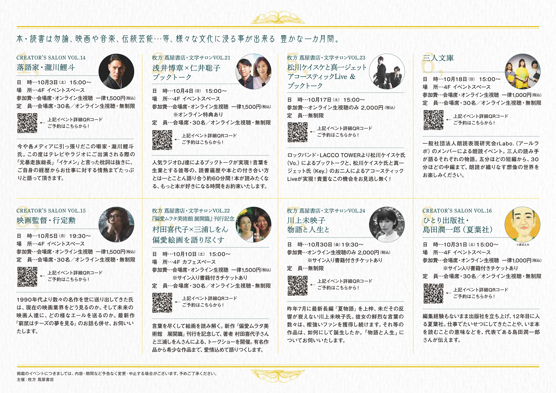
枚方 蔦屋書店/読書月間 2020/A4_2つ折り
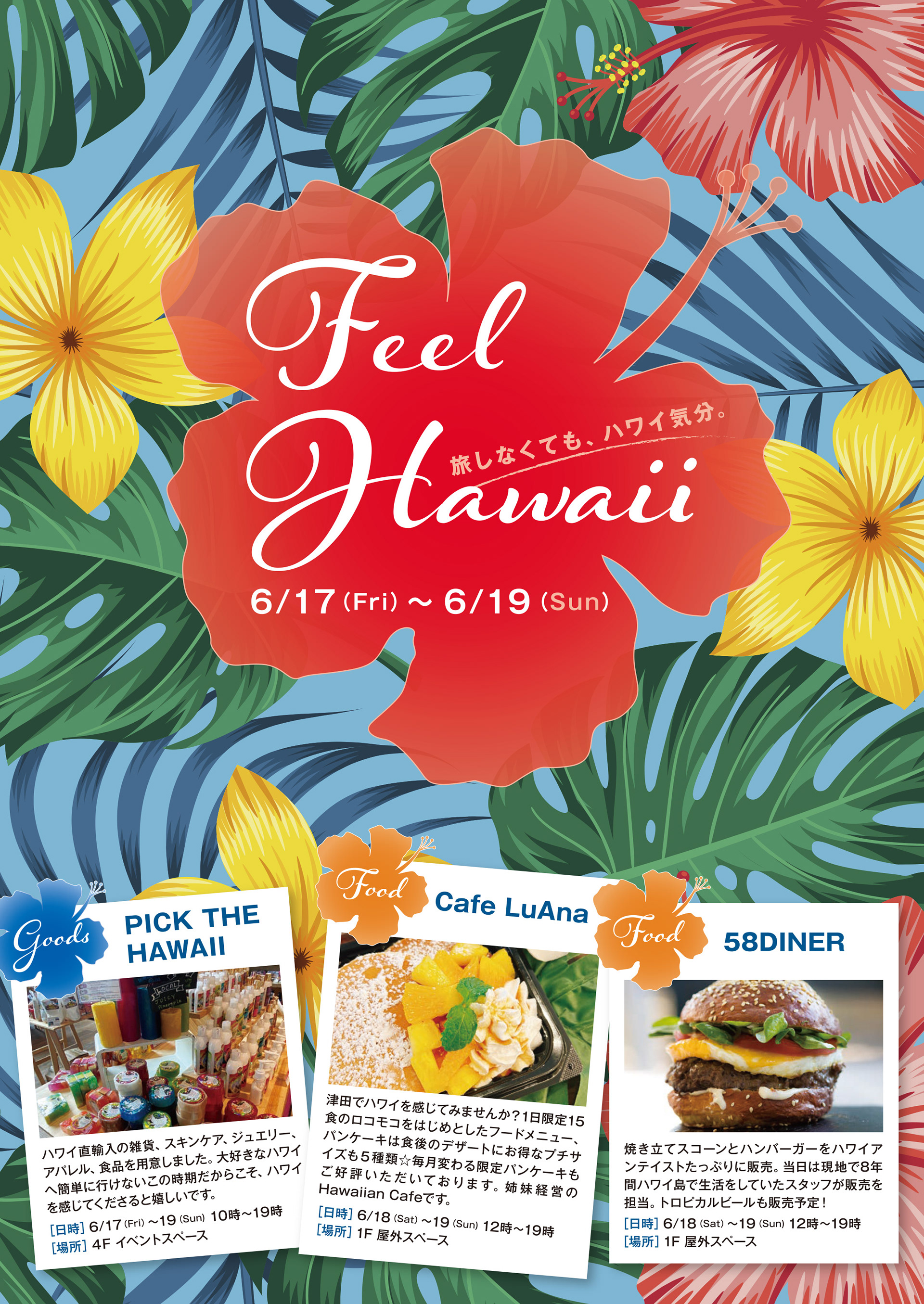
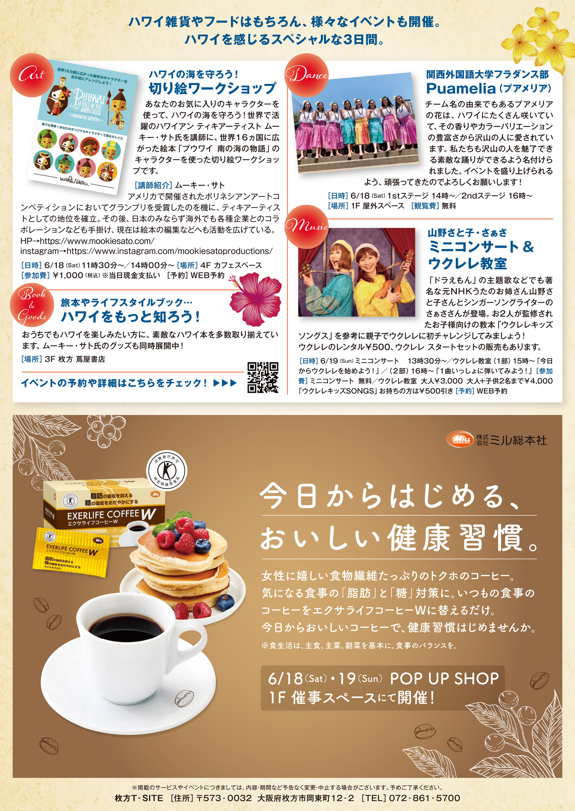
枚方 T-SITE/ハワイフェア/B5/2022
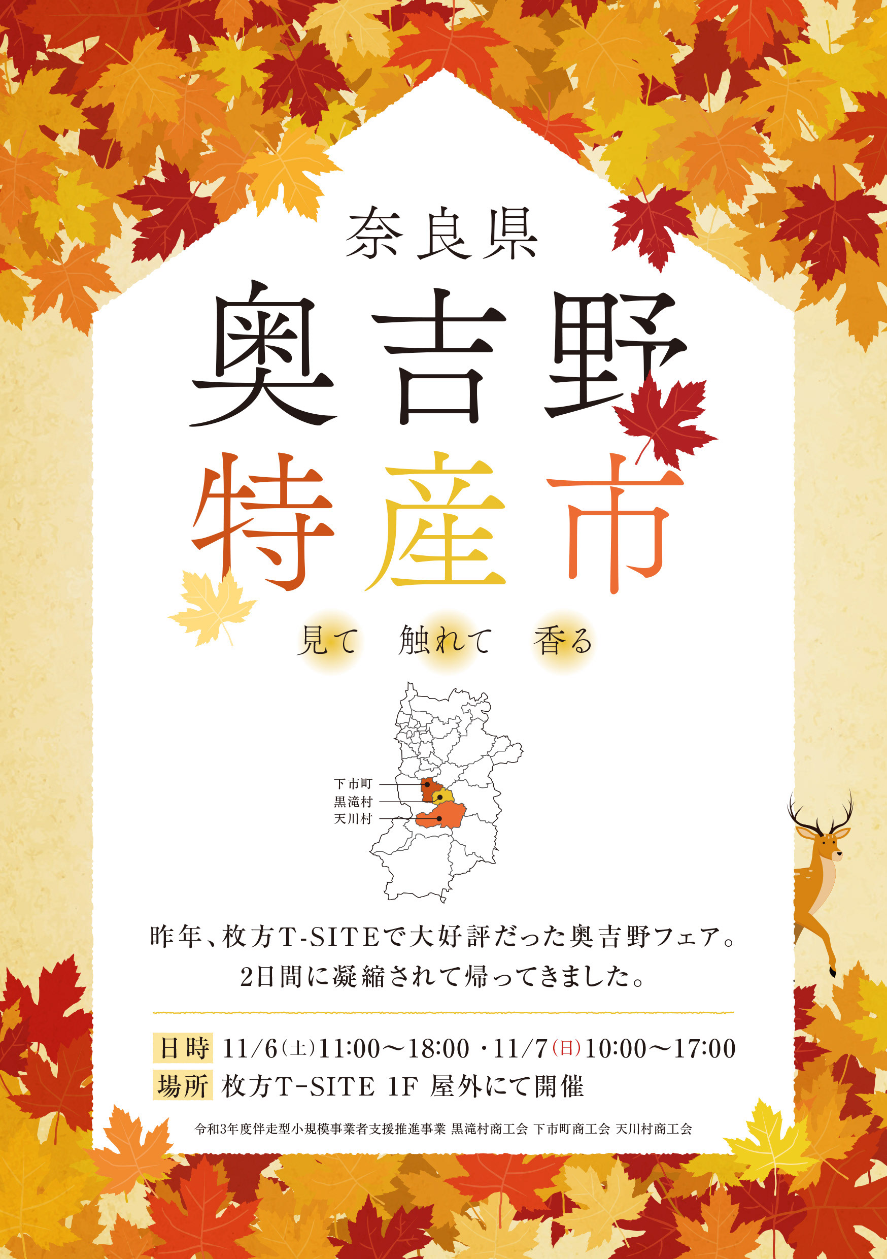
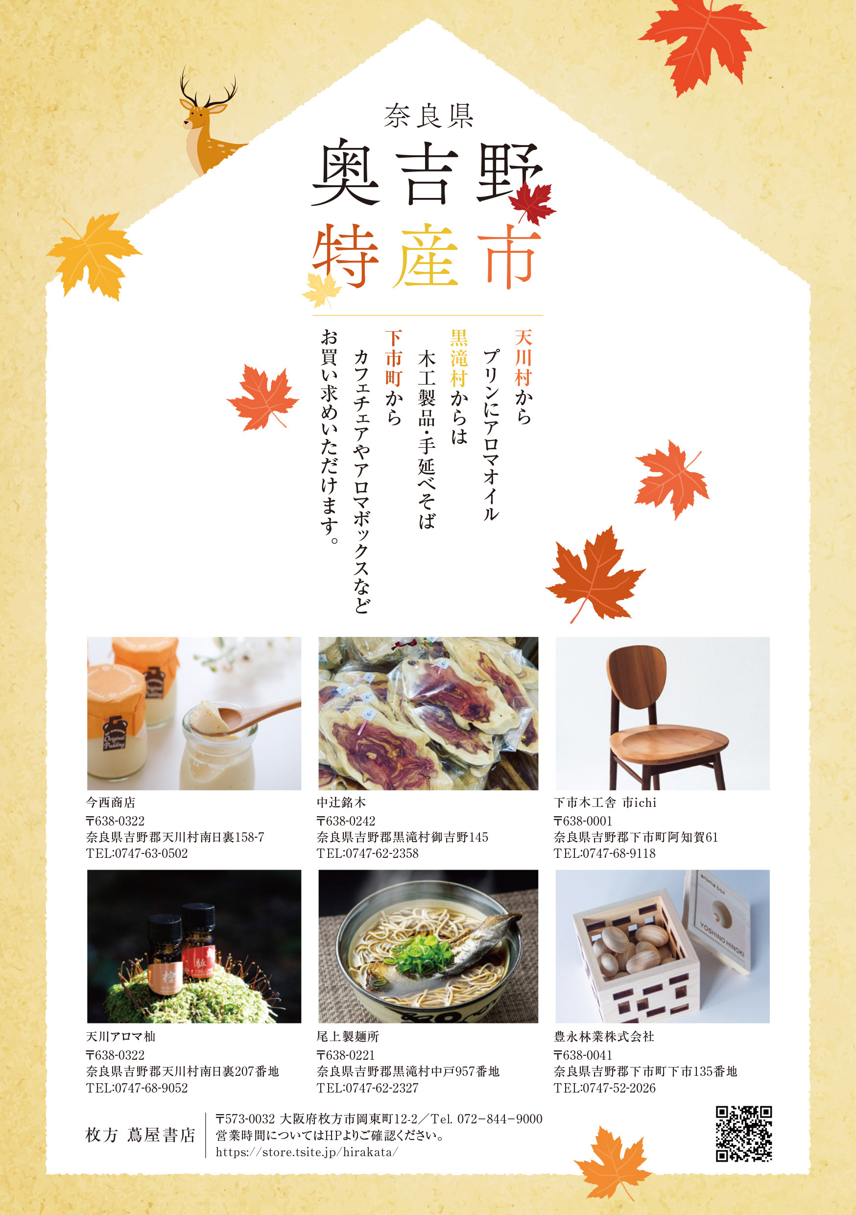
枚方 蔦屋書店/奥吉野フェア/A5/2021
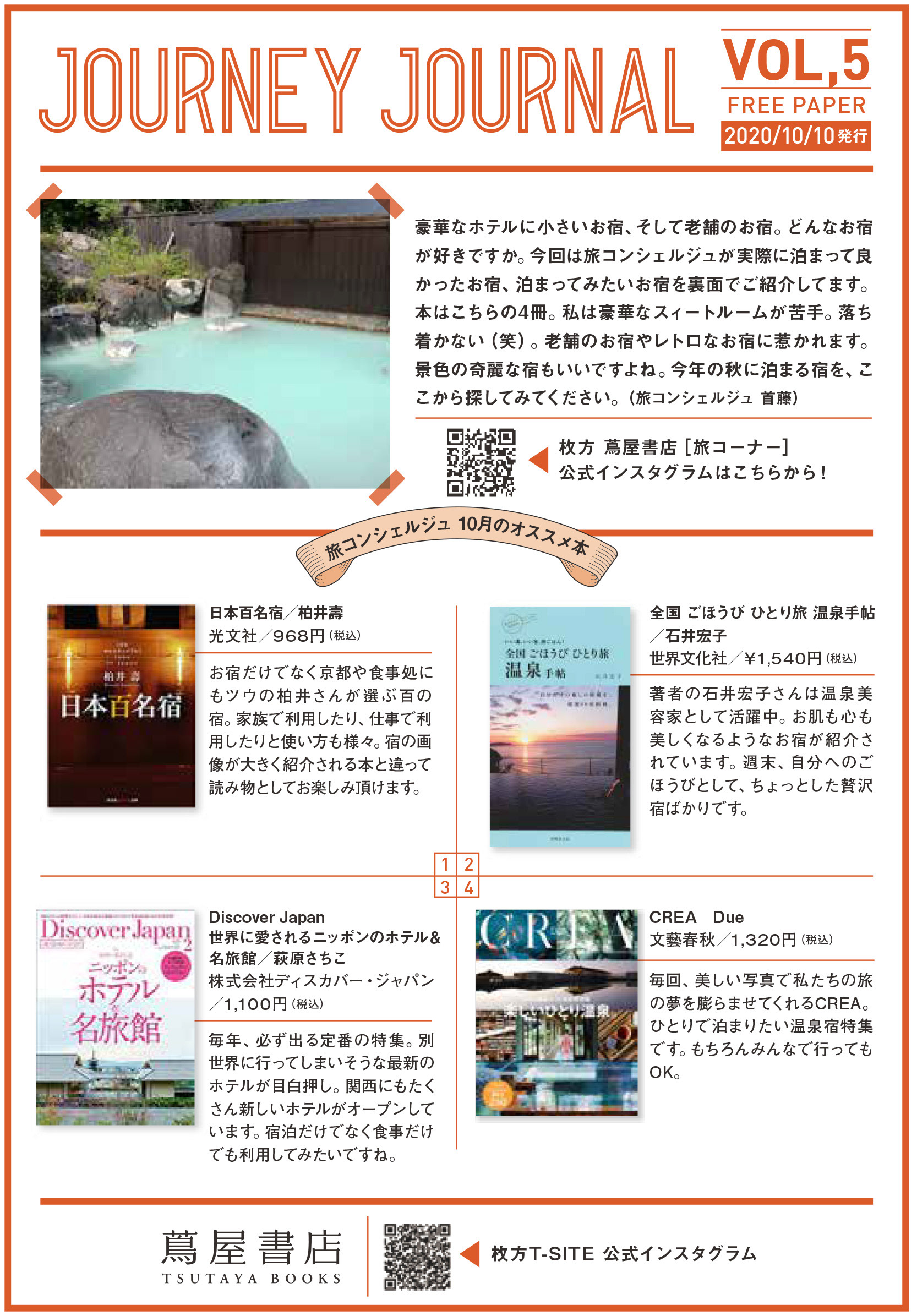
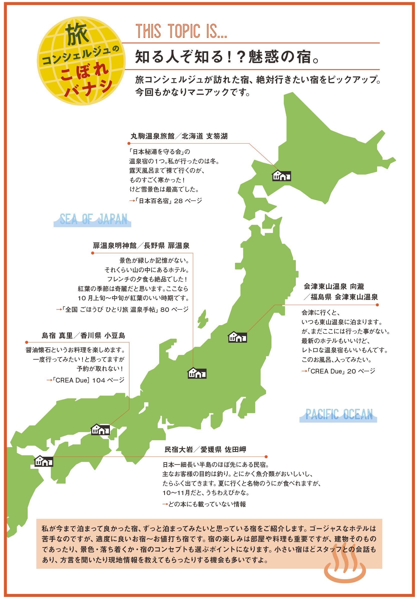
枚方 蔦屋書店/JORNEY JOURNAL/A5/2019〜2020(VOL,1〜6まで制作)
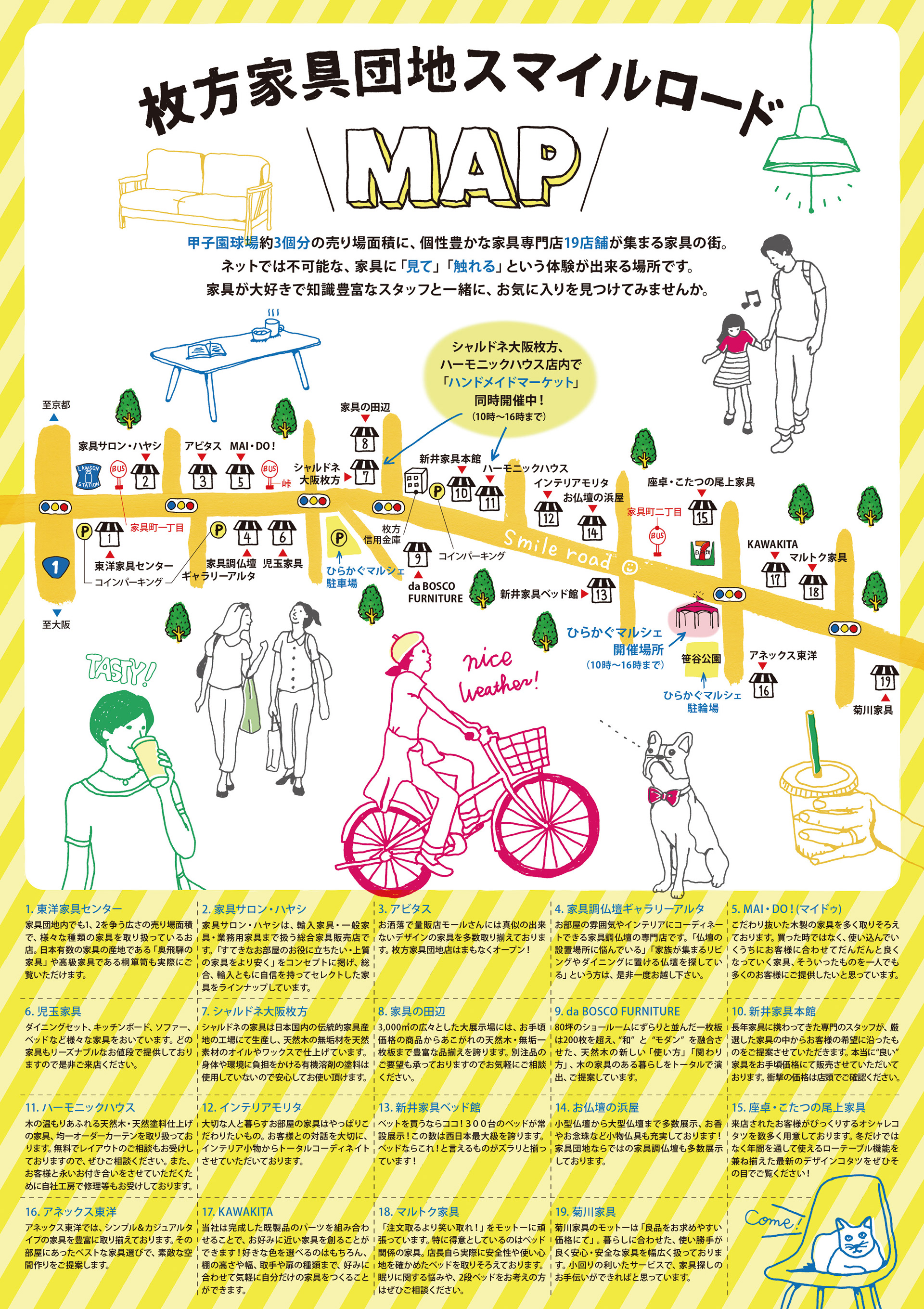
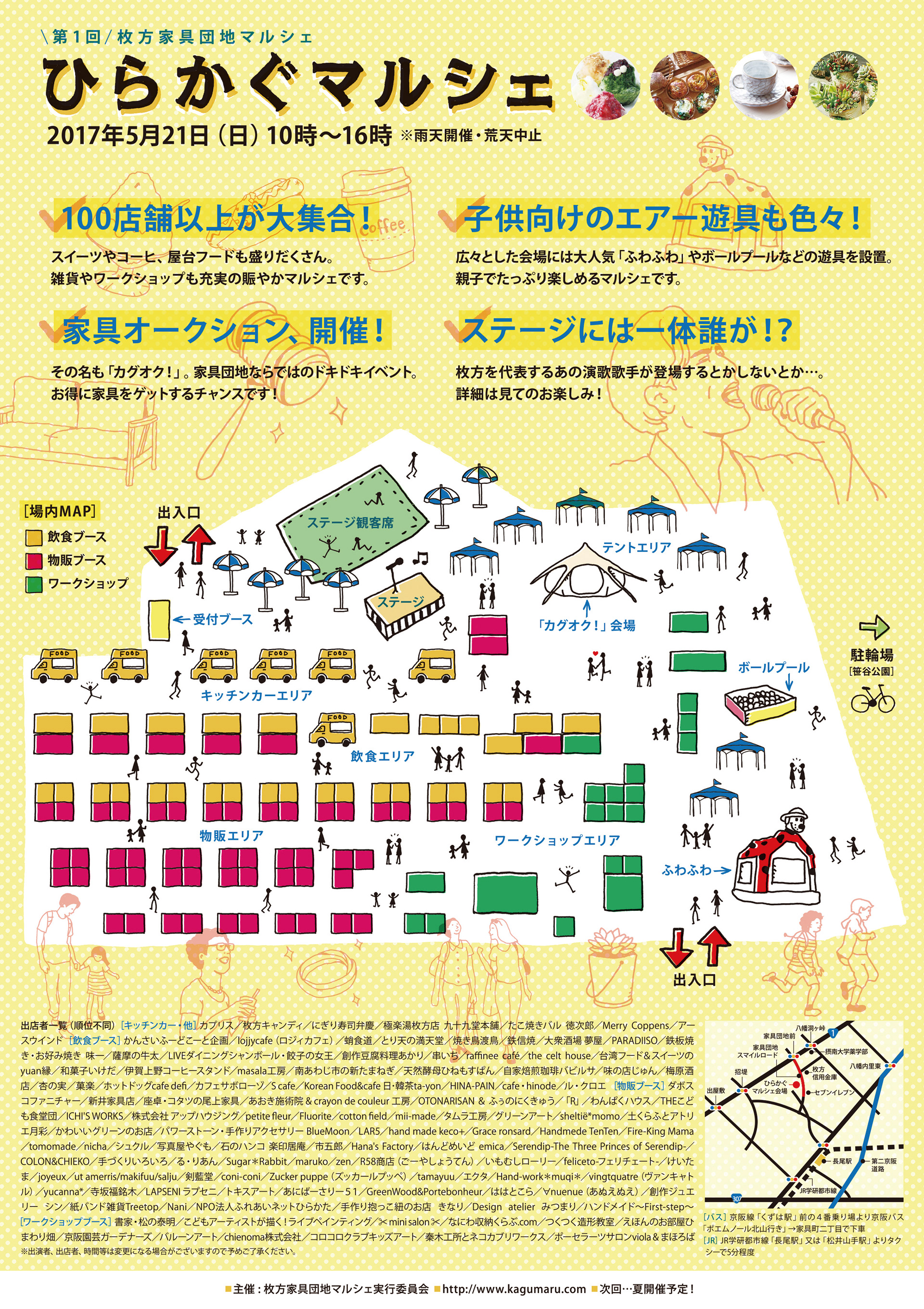
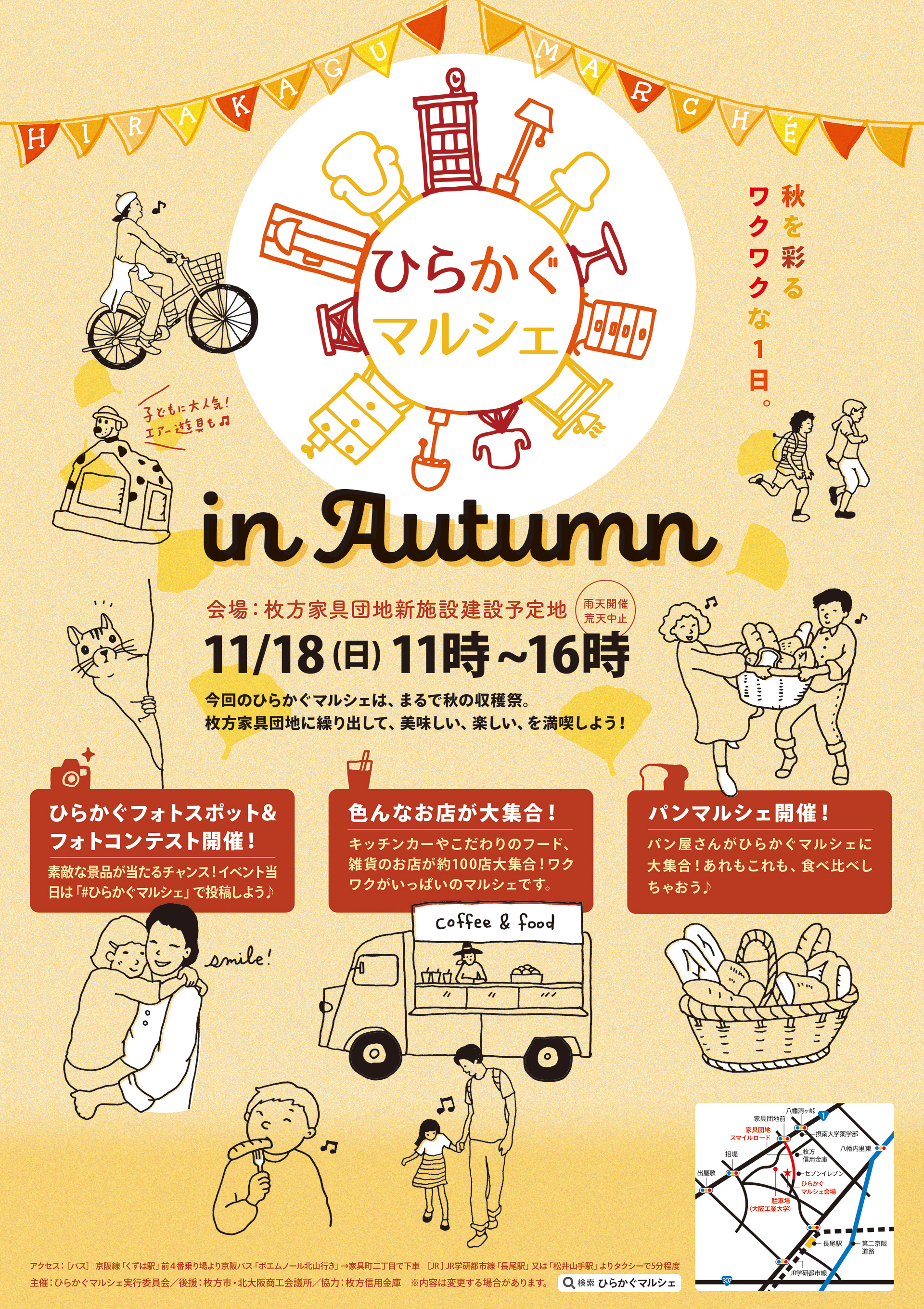
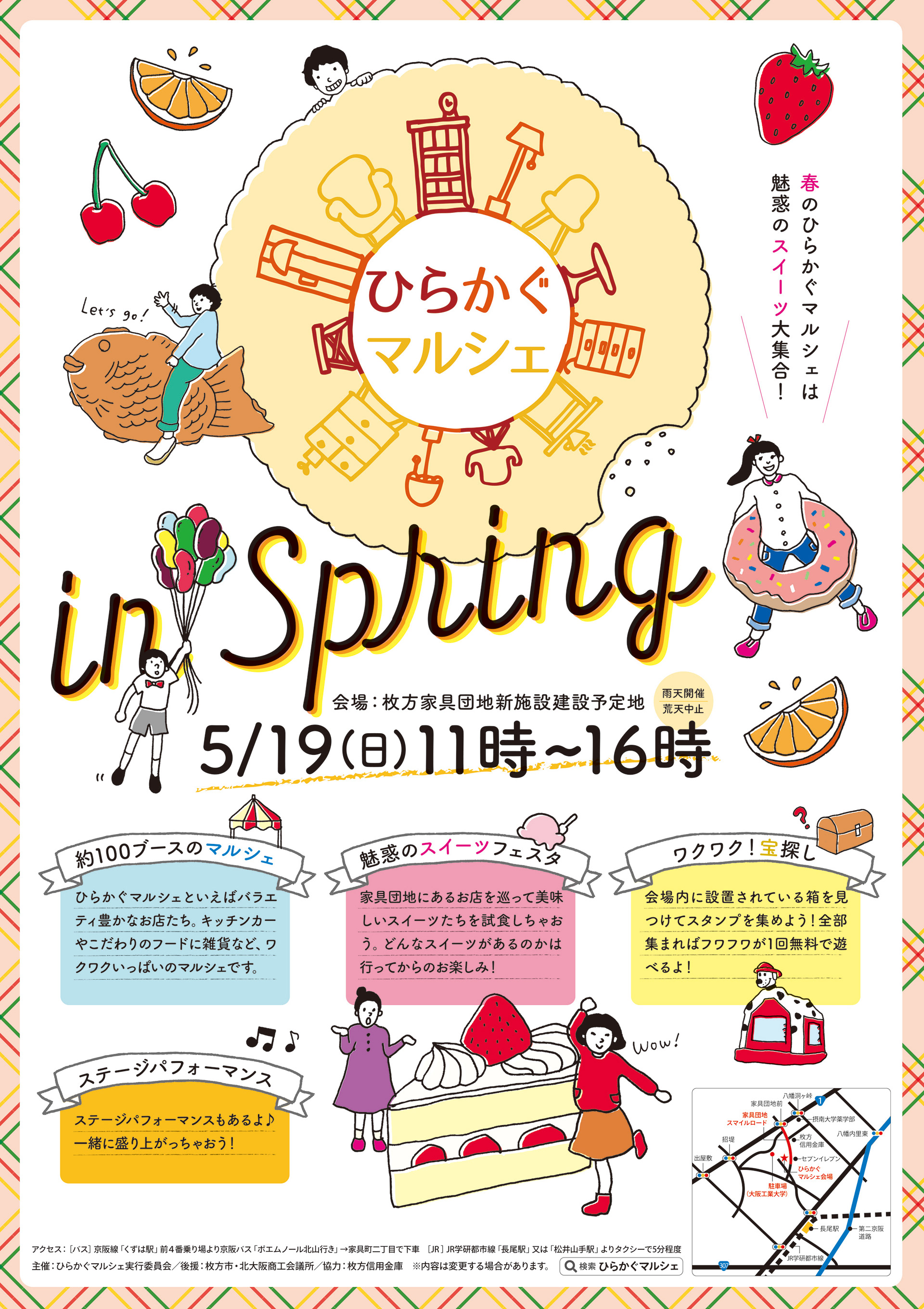
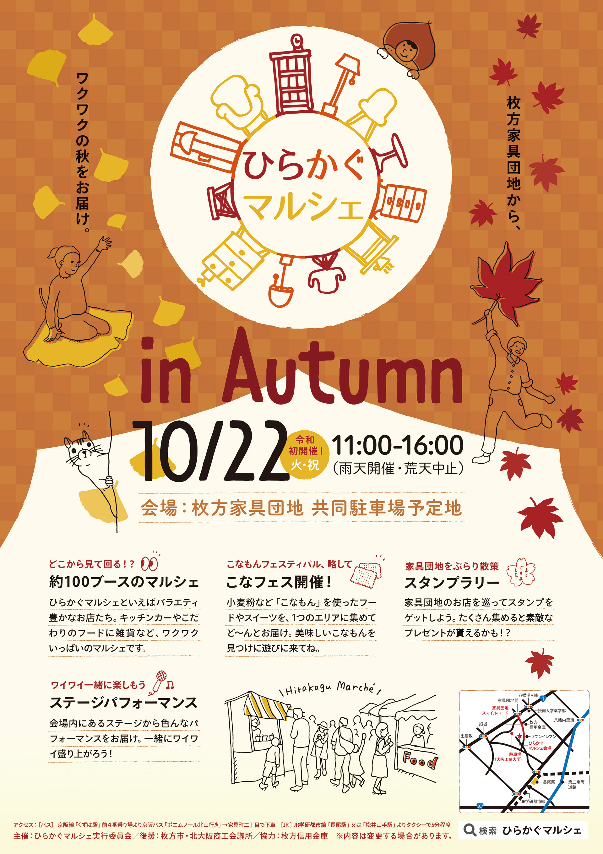
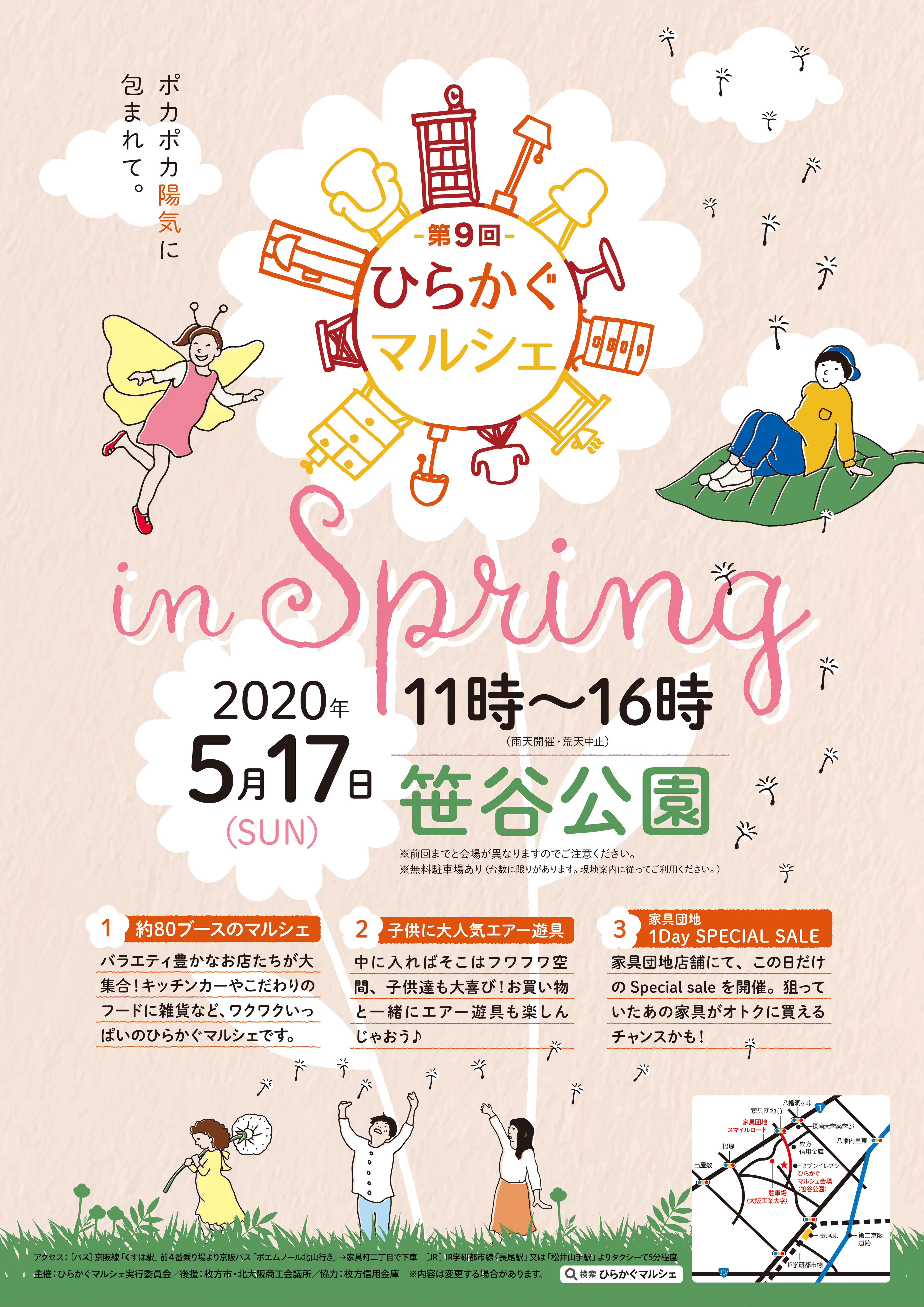
CL_ひらかたつーしん/ひらかぐマルシェ/2017〜2020
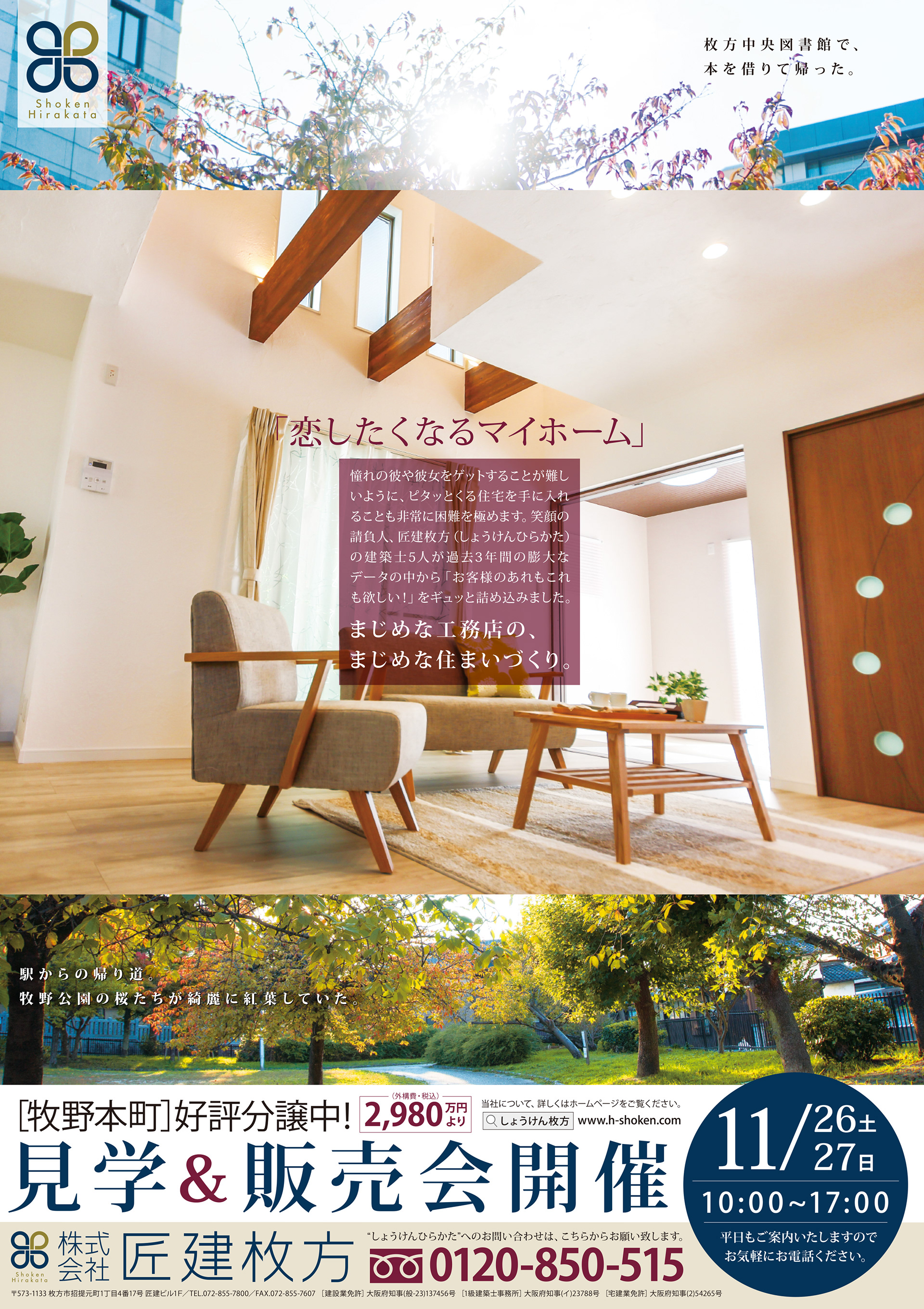
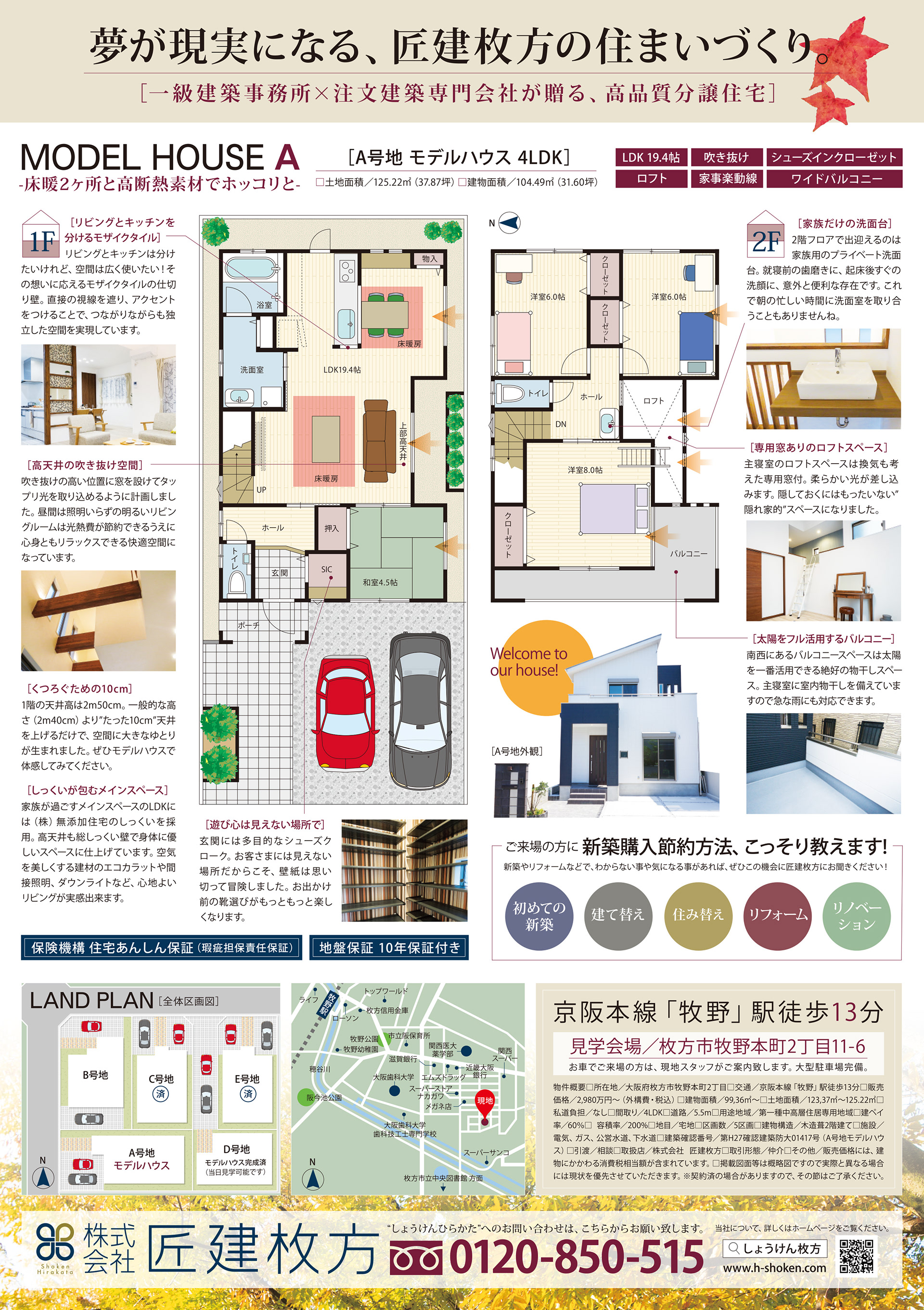
CL_株式会社匠建枚方/分譲住宅チラシ/2016
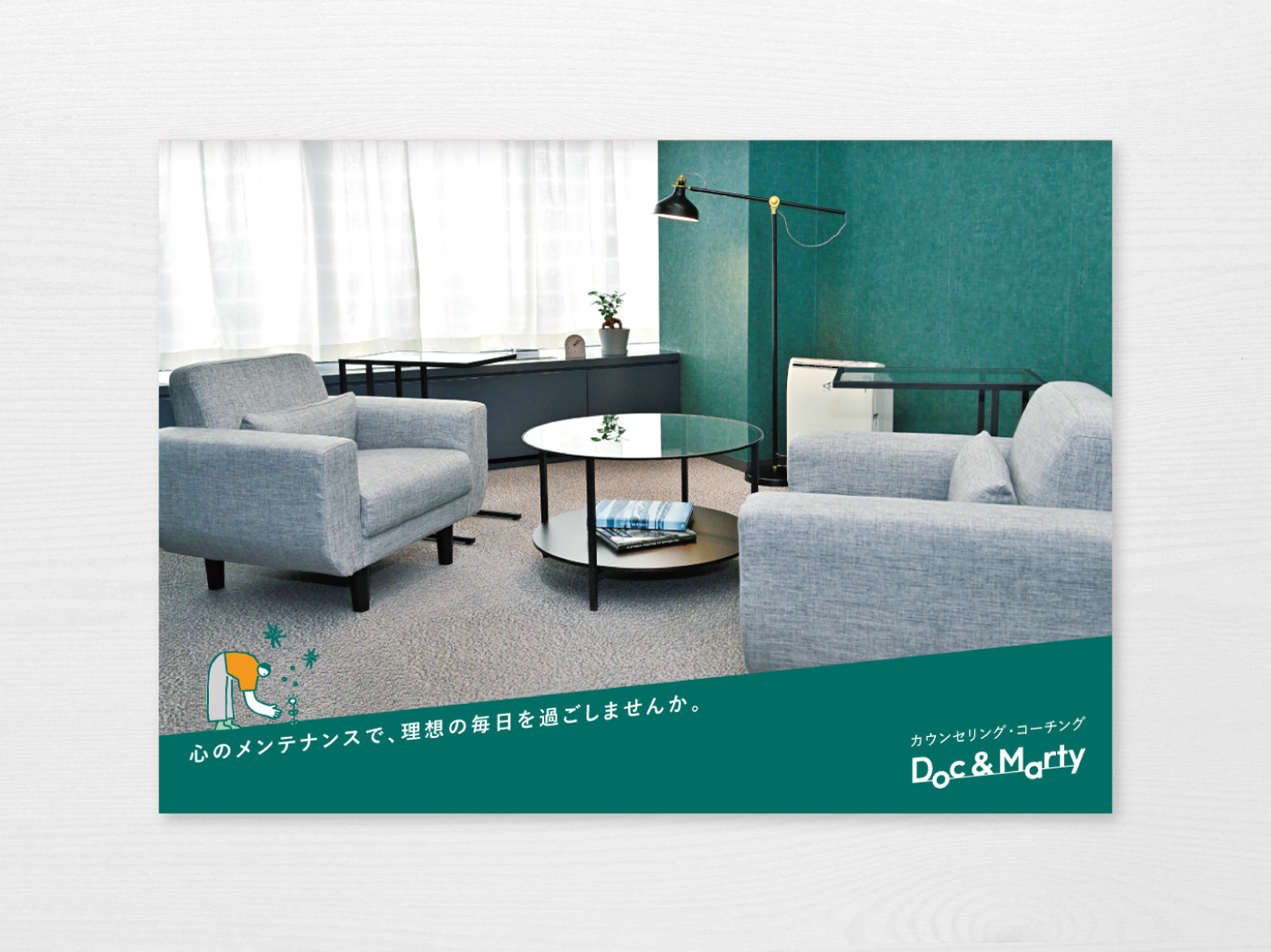
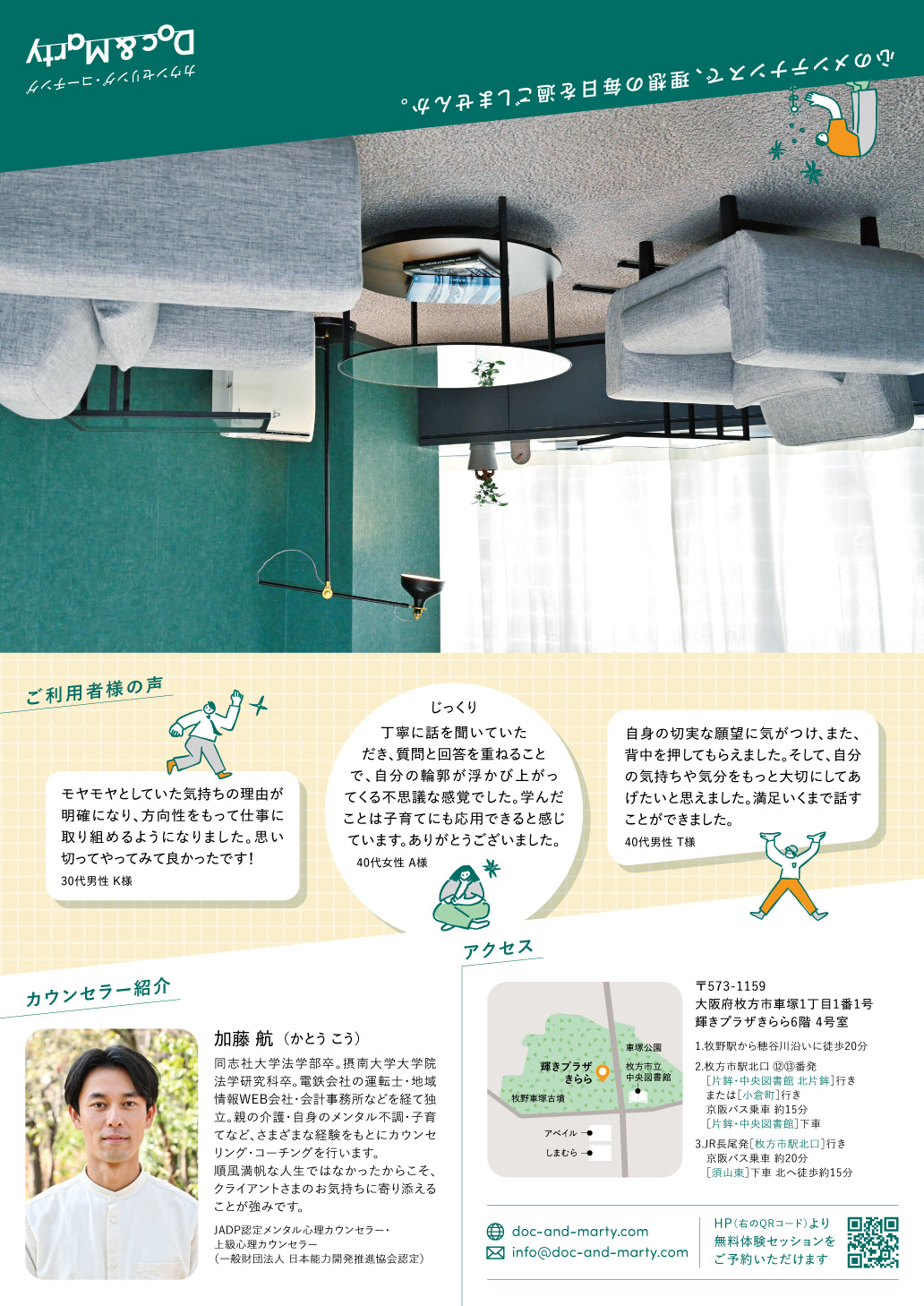
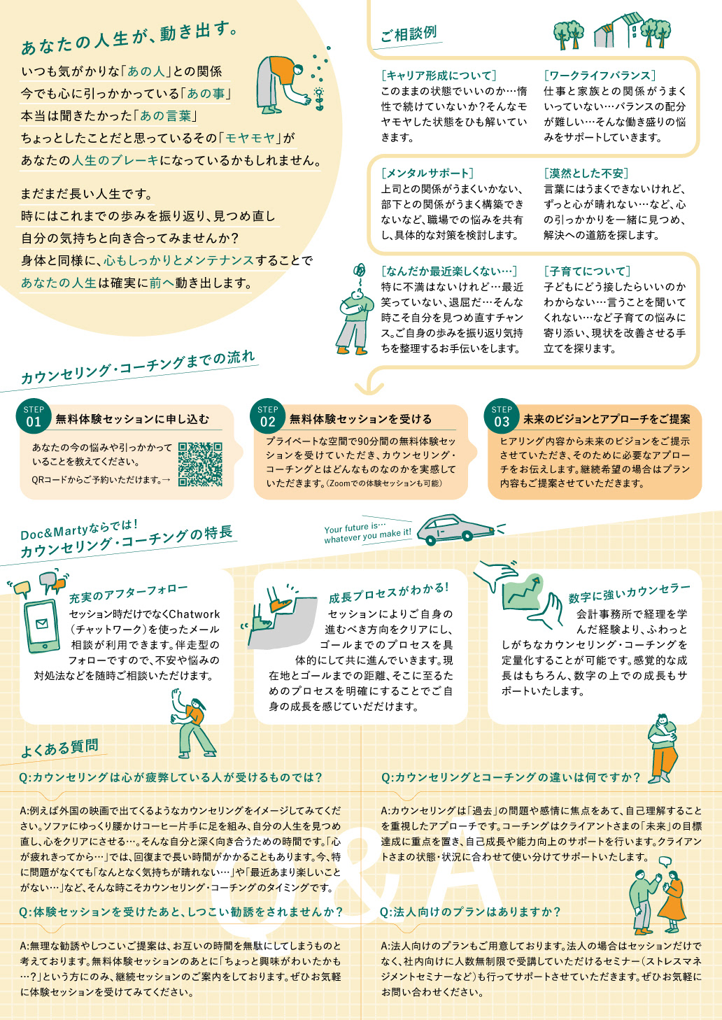
CL_Doc & Marty/カウンセリング・コーチングのチラシ/B5二つ折り/2023
海外のカウンセリングのような、心地良い空間でソファにゆったりと座りながら語る…そんな自分と深く向き合うための時間を提供したいというクライアント思いを大事に、落ち着いた色とおしゃれなイラストを使い構成。 親近感がわきつつも、きちんとした印象を与えるデザインに仕上げました。
I prioritized a client-centric approach that aims to provide a comfortable space for self-reflection, much like counseling sessions abroad. The design features a soothing color palette and stylish illustrations, creating a serene environment. The goal is to evoke a sense of familiarity while maintaining a polished impression, encouraging individuals to relax on the sofa and engage in meaningful conversations about themselves.