CL_吉薫堂/イベント企画/2024
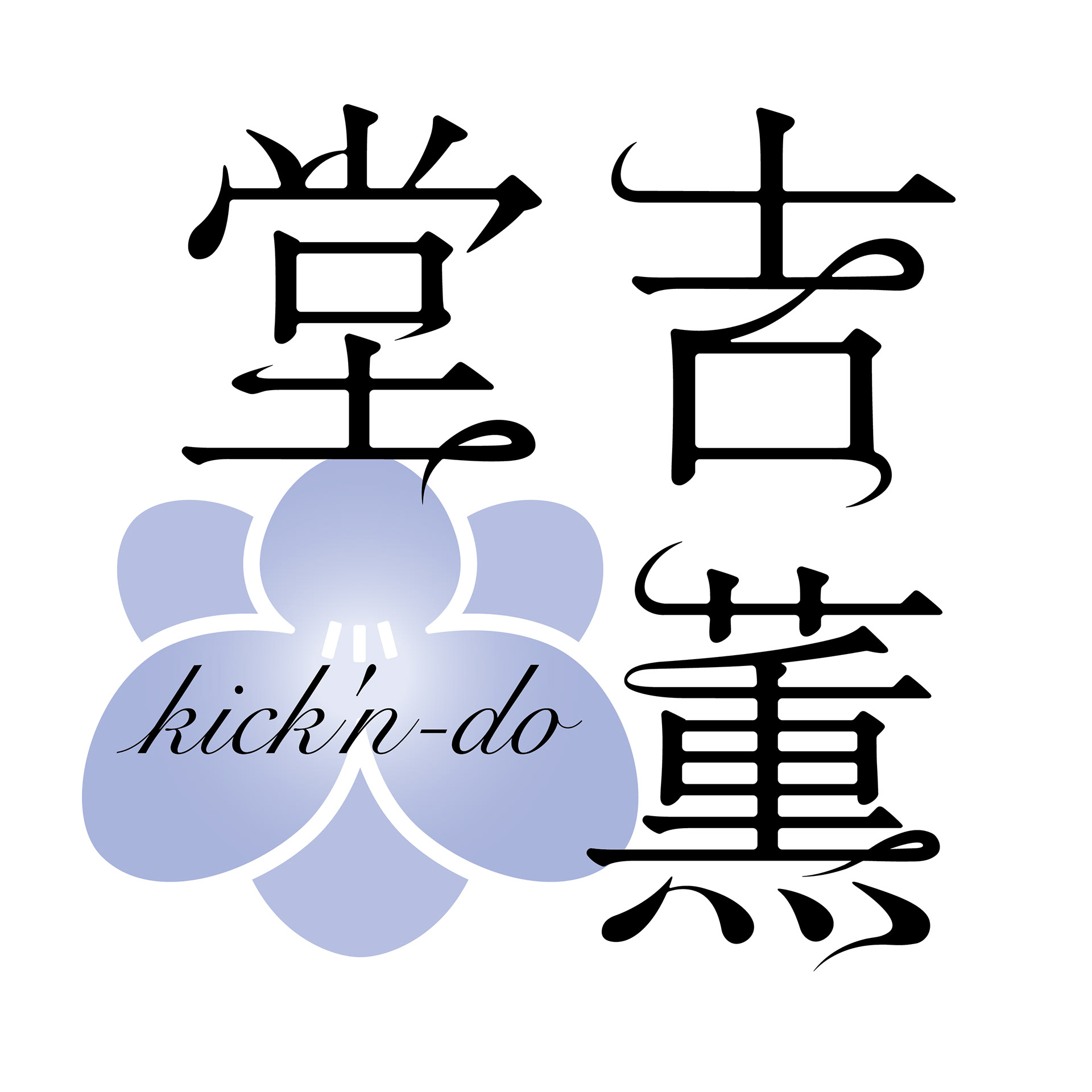
クライアントにとって特別な意味を持つフリージア(The Yellow Monky の曲「フリージアの少年」より)。その花をアイコンとして家紋調にデザインし、薫りが漂うようなフォルムの文字と組み合わせロゴを作成。フリージアの別名は香雪蘭。うっとりするような薫りがするそうです。気品と薫り高く、でもロックの精神を忘れずに。そんな思いを込めて作りました。
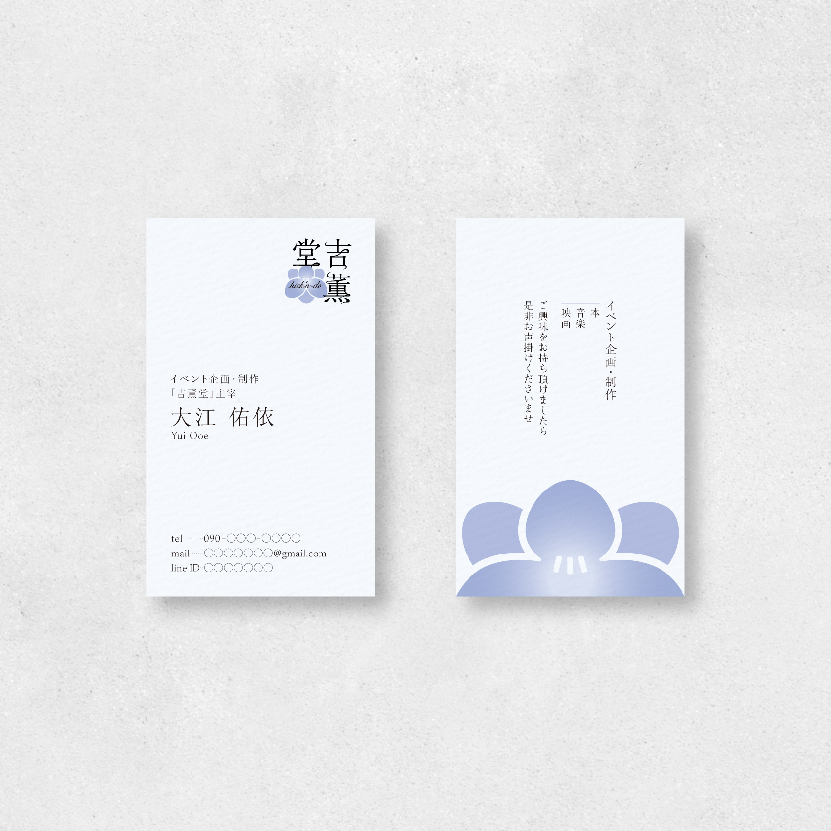
併せて名刺も担当させていただきました。受け取る側に好印象を与えられるよう、面白い手触りと厚めの紙が特徴的なマーメイド210kgをチョイス。フリージアの花を大胆にあしらいつつも上品なデザインに仕上げました。
クライアントにとって特別な意味を持つフリージア(The Yellow Monky の曲「フリージアの少年」より)。その花をアイコンとして家紋調にデザインし、薫りが漂うようなフォルムの文字と組み合わせロゴを作成。フリージアの別名は香雪蘭。うっとりするような薫りがするそうです。気品と薫り高く、でもロックの精神を忘れずに。そんな思いを込めて作りました。
併せて名刺も担当させていただきました。受け取る側に好印象を与えられるよう、面白い手触りと厚めの紙が特徴的なマーメイド210kgをチョイス。フリージアの花を大胆にあしらいつつも上品なデザインに仕上げました。
A freesia, a flower of special significance to the client, has been designed as an emblem-like icon. It is paired with typography that flows like a drifting fragrance. Freesia, also known as 'Xiang Xue Lan,' is renowned for its enchanting scent. This design embodies elegance and a rich aroma, yet retains a rock spirit. Created with these sentiments in mind.
I also designed the business cards. To leave a good impression on recipients, I chose Mermaid 210kg, known for its interesting texture and thick paper. The design features a bold yet elegant depiction of the freesia flower.
I also designed the business cards. To leave a good impression on recipients, I chose Mermaid 210kg, known for its interesting texture and thick paper. The design features a bold yet elegant depiction of the freesia flower.
CL_fureru./花屋/2023
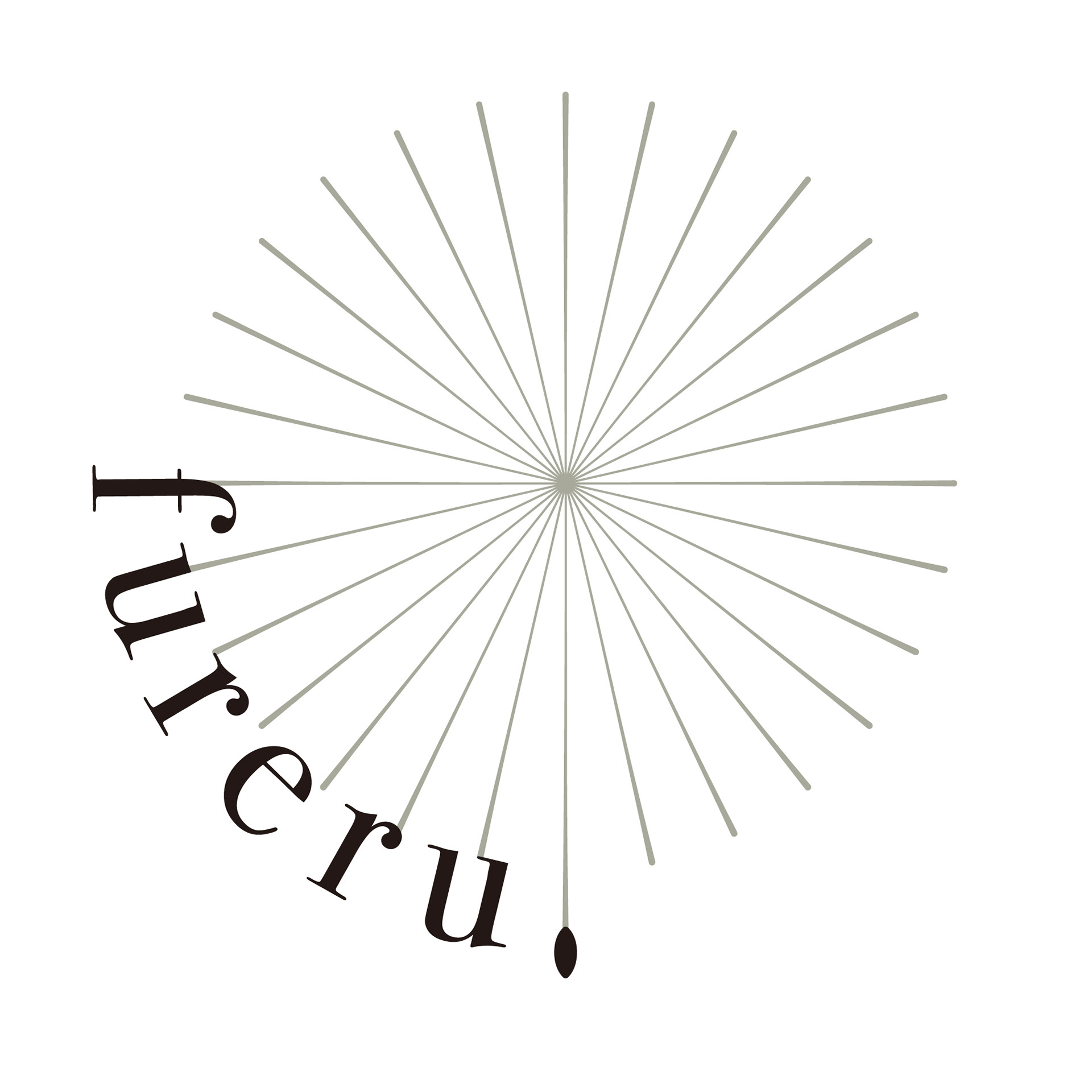
fureru.はフィジカル的に花に触れることはもちろん、その行為を通じて知識や心の琴線に触れて欲しいという思いから、線を基調にしたデザインを採用。線は放射状にレイアウトし、綿毛のようなフォルムを形成してfureru.のドット部分を種に見立てました。花に「fureru.」ことでお客様の心が満たされ、その思いが綿毛のように舞っていき、幸せの連鎖が生まれますように、という願いを込めました。
The word "fureru" represents the act of physically touching flowers and, more importantly, the desire for people to connect with flowers through this action, whether by gaining knowledge or touching the strings of the heart. The design adopts a linear theme, with lines radiating outwards to form a cotton-like shape resembling a seed in place of the dot in "fureru." By "touching" flowers, I hope to fill the hearts of customers with joy, and as their emotions float like cotton seeds, I wish for a chain of happiness to be born.
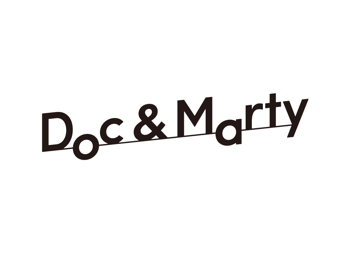
CL_Doc & Marty/心理カウンセラー ・コーチング ロゴ/2023
コーチングの言葉の由来であるCoachは馬車を意味します。「大切な人をその人が望むところまで送り届ける」という馬車の役割から派生して、コーチングという言葉が生まれました。その馬車をモチーフに…と思いきや今回は馬車ではなくタイムマシーンのデロリアン!なぜならばそう、Doc & MartyはBTTFのキャラクターだからです。「o」と「a」をデロリアンのタイヤにみたて、右上がりにすることで、クライアントの人生が上向く様子を表現しました。Doc & Marty のように最高のバディとなり、クライアントを明るい未来へと送り届けたいという思いが込められています。
コーチングの言葉の由来であるCoachは馬車を意味します。「大切な人をその人が望むところまで送り届ける」という馬車の役割から派生して、コーチングという言葉が生まれました。その馬車をモチーフに…と思いきや今回は馬車ではなくタイムマシーンのデロリアン!なぜならばそう、Doc & MartyはBTTFのキャラクターだからです。「o」と「a」をデロリアンのタイヤにみたて、右上がりにすることで、クライアントの人生が上向く様子を表現しました。Doc & Marty のように最高のバディとなり、クライアントを明るい未来へと送り届けたいという思いが込められています。
The word "coach" from the origin of coaching comes from the term for a horse-drawn carriage. It evolved from the carriage's role in "transporting important individuals to their desired destinations." Instead of a traditional horse-drawn carriage, we used a DeLorean this time! That's because, yes, Doc & Marty are characters from BTTF. By visually resembling the "o" and "a" in "DeLorean" to the car's tires and tilting them to the right, it represents the idea of a client's life moving in an upward direction. This design embodies the desire to become the best partners like Doc & Marty and deliver clients to a brighter future.
枚方T-SITE/shugei lab. 店舗ロゴ/2020
CL_Chill/プライベートネイルサロン ロゴ/2014
CL_AHV PROGRAM/DF_Vancraft/ロゴ/2009